Scottish American
Website redesign
Client: Scottish American grew out of an investment fund focused on acquiring and managing insurance distribution businesses. The company takes pride in its unconventional, producer-led culture, where teamwork is exemplified by removing official titles and hierarchical organizational structure.
Problem: Scottish American has an energetic, fun, start-up culture that wasn’t fully being reflected in their online presence. The website lacked personality and visual cohesion. Aside from the employee mangatars, the website was a bit drab. The founder wanted the it to feel unique and engaging compared to their competitors.
Role: Art Direction • Branding • Visual Design
Goals: The goal of this project was to redesign Scottish American’s website and establish a visual identity that separated them from the rest of the corporate insurance websites. Not only would the site act as an information board about the company and their mission, but it would also be a resource hub for producers and partners. The site should be easy enough for a kid to navigate.
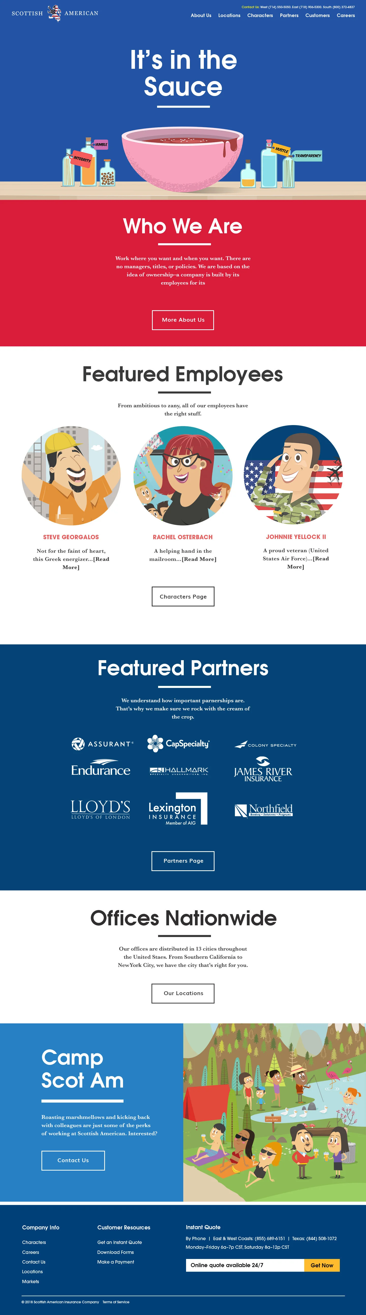


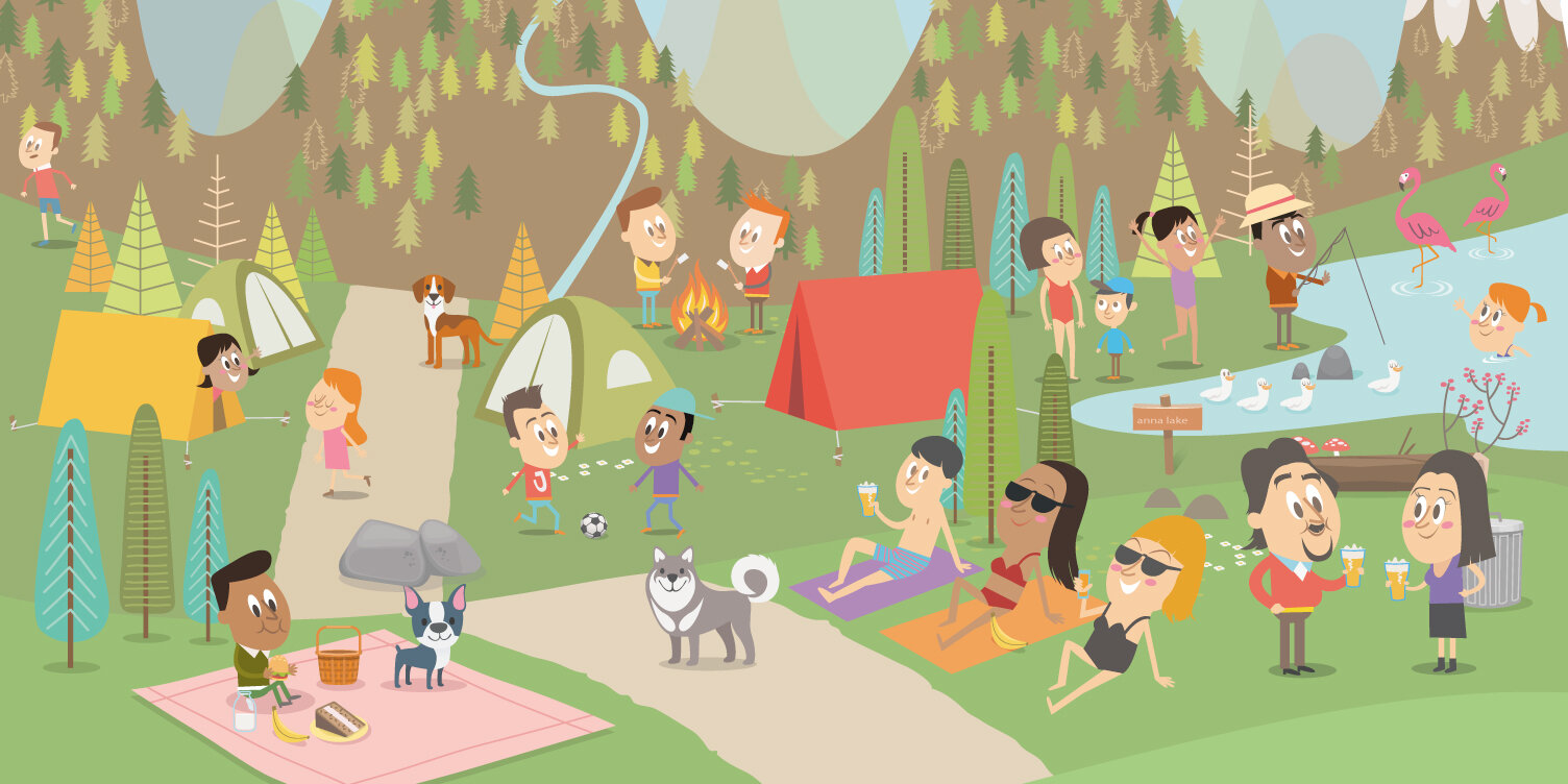
How I Helped: I redesigned Scottish American’s website and established a visual identity for the company that was vibrant and fresh. In addition, I commissioned and art directed illustrator Federico Bonifacini to create content that would enhance the website and showcase some of their featured employees.
Tools: Photoshop, Illustrator